
apolis is a Greek word, meaning citizen of no country. This was the center stone for the rebrand of RJT Compuquest: their global reach.
I was approached by the IT consultancy company to create a set of looping animated patterns for their new website and also a set of animated spot illustrations.
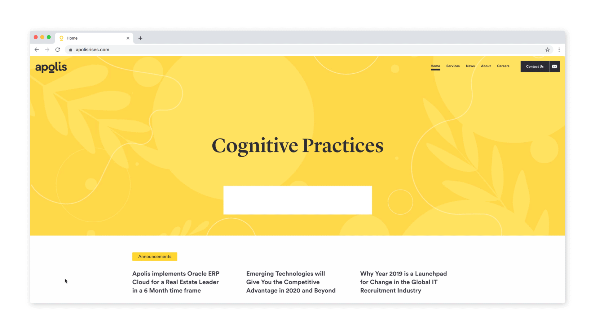
The idea was to play with their new claim Apolis rises and the design of the underlined 'o' and welcome the users with a sun rise. This, framed with organic and geometric elements softly floating in a loop.
The spot illustrations represent friendly characters in line with the diversity within the company. Three appear as seamless non-distracting loops and three as static images.